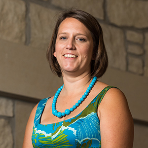
Tritia Moneypenny
* What made you decide to put an infographic resume and your own website together?
 I was partially inspired to create my own website because colleagues I admired had their own; which were particularly helpful during employment transitions. I knew I would be approaching such transitions, so I figured I needed a website and a catchy resume. Officially, the website was an assignment in my Youth & Technology course for my graduate degree (which I took in summer 2015). While we thought about how youth engage in the virtual world, we also learned how professionals do. Our discussions were via Twitter (instead of the Blackboard chat rooms), our assignments included submitting our analyses via infographics, videos, and op-ed pieces for local newspapers. We also needed to create a website. Of course, I went above and beyond the course requirements in terms of content and aesthetics, and continue to adjust the website on a quarterly basis. Additionally, my career coach Mary Jeanne Vincent (http://www.careercoachmjv.com/) is big on brand identity and consistency. I first employed Mary Jeanne in 2005 to help me reassess my career aspirations, and then again in 2012/2013 for putting together my graduate school application. Her trainings are still top of mind for me.
As for creating an infographic resume (which was not an assignment), I wanted a way to showcase my experiences visually. I'm a visual learner and processor, so I really enjoy being able to put icons, timelines, bubbles, etc on my infographic resume. I can share more information in visual ways than a traditional resume allows. For example, I'm able to indicate volunteer and paid work via colors as well as put them on the same "timeline" (aka, in the same space graphically), overlapping experiences that occurred simultaneously.
* What have these materials done for you in terms of opportunities or networking?
This is a hard question to answer. It's tough to know how, when, and why others view my website. I do feel it has raised my credibility as a professional. I enjoy having a place to showcase all that I've done and all that I'm skilled in in one place. I've sent people to my website if they are interested in my services, but I don't know if this has converted to paid work. I do include a link to my website and my LinkedIn profile in my signature in all my emails, which again, I feel adds credibility to my professional communications. One of the things I'd like to add to my site is a blog... my struggle is I'm not a consistent writer or generator of content (I'm more of a consumer; old-school user). This will have to change with the times, though.
I have received a lot of positive feedback on my infographic resume. I usually submit it along with my traditional one. Unfortunately, it doesn't qualify as an acceptable resume to larger organizations that use computer-generated screenings or processing of applicants. I hope this changes in the future as I feel the infographic resume expresses my personality and talents better than traditional ones.
* Describe the experience of putting your own website together.
It was a lot of fun and a lot of hard work. I selected Wix as the service because of the options and add-ons it offered, as well as automatically having a mobile version. I wanted to be different, so using Word Press was not appealing. I enjoyed pulling pictures together to communicate my skills, experiences, and interests. I enjoyed having a place to link some of my graduate work too. I enjoyed being bright, energetic, and visual on my website! I did ask for feedback from some of my trusted colleagues, friends, and family members. They were able to catch typos and warn me when things didn't appear appropriately on the mobile version. It will be important to shift my website maintenance mindset into showcasing my work as an active professional.